
Kaiser Permanente Grace Hopper Celebration Presence
The Problem
Kaiser had a limited budget to attract and engage with some of the thousands of attendees at GHC, with a modest 10’x10’ booth space among hundreds of other companies. The prior year’s booth was pretty, with an entire wall of live plants, but the green wall was extremely expensive to ship. Renting seating and storage for the booth via a vendor was pricey, and construction was an entire day affair. Furthermore, many conference-goers unfamiliar with Kaiser did not immediately recognize which industry was represented or that they were recruiting for technical roles.
The Solution
Standard rental or pre-fab booth structures can begin to look redundant among aisles of similar booths, while most custom booths cost an arm and a leg. To maximize budget while creating something completely different, I located a vendor who could construct a custom-designed booth out of foamcore/gatorboard. I designed the structure with a full-color back wall and dimensional cutouts placed over it, featuring illustrations and a logo that clearly focus on health technology. Shaped pedestals made of the same gatorboard material served as tables for swag and doubled as storage. Orange storage ottomans fold up for easy shipping and setup, eliminating the need for additional rented seating and providing more space to hide things away in the booth. The entire booth could be flat-packed in a cardboard box for shipping.
Illustration mockup of booth during planning phase.
Ultimately, the cost for the new design was only 25% of the previous year’s, allowing the team to put funds towards a networking event for targeted attendees, providing another opportunity for dedicated face time with potential candidates. Engagement at the booth, as measured by badge info capture, was also up 72% from the prior year.

This is all cardboard, gatorboard and foamcore — and came in a flat-pack large shipping box via standard UPS instead of freight.
Postcard
A postcard with graphics that called back to the booth design, featuring the IT Rotation Program, was passed out to attendees to advertise the existence of the program and encourage application. The handout featured a matte soft-touch surface and substantial weight, setting it apart from standard trifolds or glossy rack cards others were passing out. The content featured the high points of the program as well as two illustrated real-life case studies.
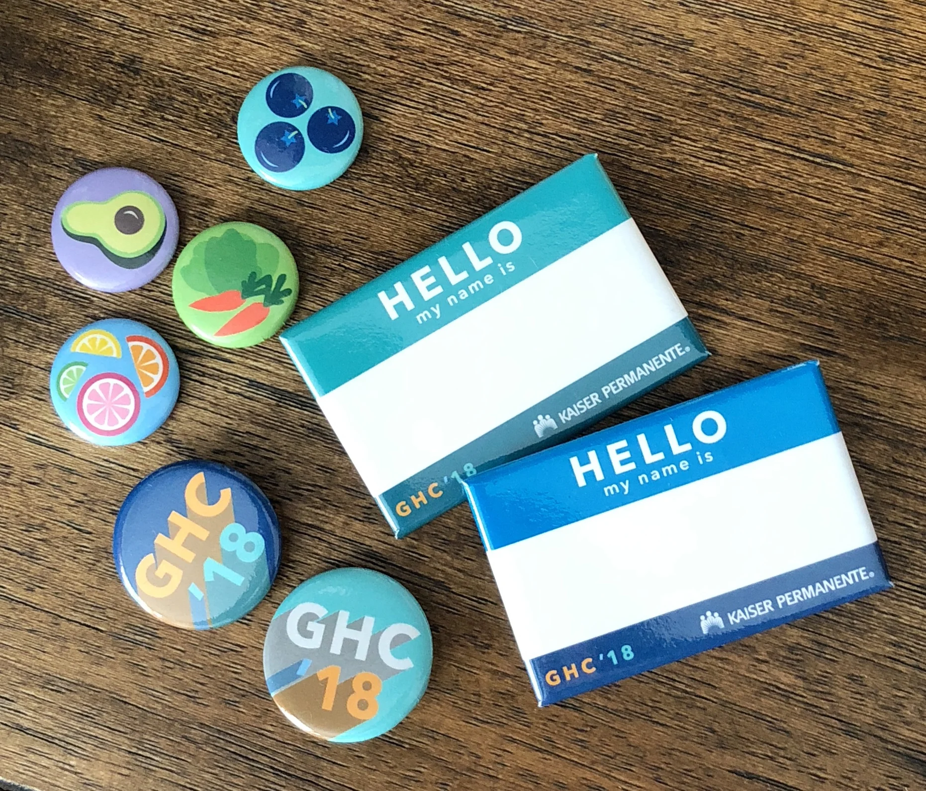
Buttons
Finally, some custom illustrations on collectible buttons served as swag, a decision I made after observing the popularity of “button bars” among the attendee age group at other conferences. The buttons portrayed fruits and veggies to convey healthy living in a fun and colorful way, and a handy nametag button (bonus: our brand and booth number were also on the back of each pin). The team reported that attendees came to the booth specifically to collect these.